Information signs guide you to routes, destinations, and services, and a key design rule says sign text should use 1 inch of letter height for every 10 feet of viewing distance. For your Ontario G1, think of these signs as the road's guidance system: usually green, blue, or brown, helping you find where to go without giving a command or warning.
If you're studying for the G1 right now, this is one of those topics that can seem easier than it really is. Many learners glance at information signs and think, “Those are just the helpful signs.” That's partly true, but on test day you need to do more than recognise that a sign is helpful. You need to know what kind of help it gives, why it looks the way it does, and how to separate it from warning and regulatory signs.
That's where many people get stuck. A hospital sign, a route marker, a parking sign, and a sign for a recreational area don't all mean the same thing, even though they all fall under the broad idea of guidance. Once you understand the logic behind the colours, symbols, and placement, memorising them gets much easier.
Why Information Signs Are Your Guide on the Road
You're driving in an unfamiliar area. You're not being warned about a sharp curve, and you're not being told to stop or yield. Instead, you see signs pointing to a hospital, parking, a highway exit, or a nearby service area. Those are information signs. Their job is to help you move through the road system with less confusion.
That matters more than many beginners realise. A new driver often focuses on the dramatic signs first: STOP, DO NOT ENTER, school bus, lane ends. But everyday driving also depends on signs that guide you where to go, what services are nearby, and how to follow a route without last-second decisions.
What information signs do
Information signs usually answer practical questions such as:
- Where am I going? Signs for streets, highways, exits, and destinations.
- What's nearby? Signs for fuel, food, lodging, hospitals, parking, and tourist information.
- Is this place meant for recreation or public use? Signs for parks, scenic areas, and cultural sites.
They guide rather than command. That's the key distinction.
Study clue: If a sign helps you find a place or service, it's often an information sign. If it tells you what you must do, it's likely regulatory. If it alerts you to danger ahead, it's likely a warning sign.
Why the G1 cares about them
In Ontario, the official driver handbook isn't just a casual booklet. It sits behind a standardised road-sign system that every G1 applicant is expected to learn, and the G1 test follows that handbook-based framework. That means information signs are part of the formal knowledge standard used in licensing, not optional trivia. You can review that broader test framework in this complete Ontario G1 guide.
Ontario's handbook groups road signs into core categories including regulatory, warning, temporary condition, and information signs. That classification matters because the test often checks whether you can identify the sign's purpose before you even interpret its exact meaning. The handbook-based system is especially important in a province with more than 16 million residents, where many learners move through a graduated licensing system and must master sign knowledge before advancing to higher-risk driving stages, as described in this Ontario road-sign and licensing context.
Decoding the Colours of Information Signs
The fastest way to get better at information signs is to stop treating them as random pictures. They follow a visual system. Once you learn the colour logic, many signs become easier to recognise under pressure.
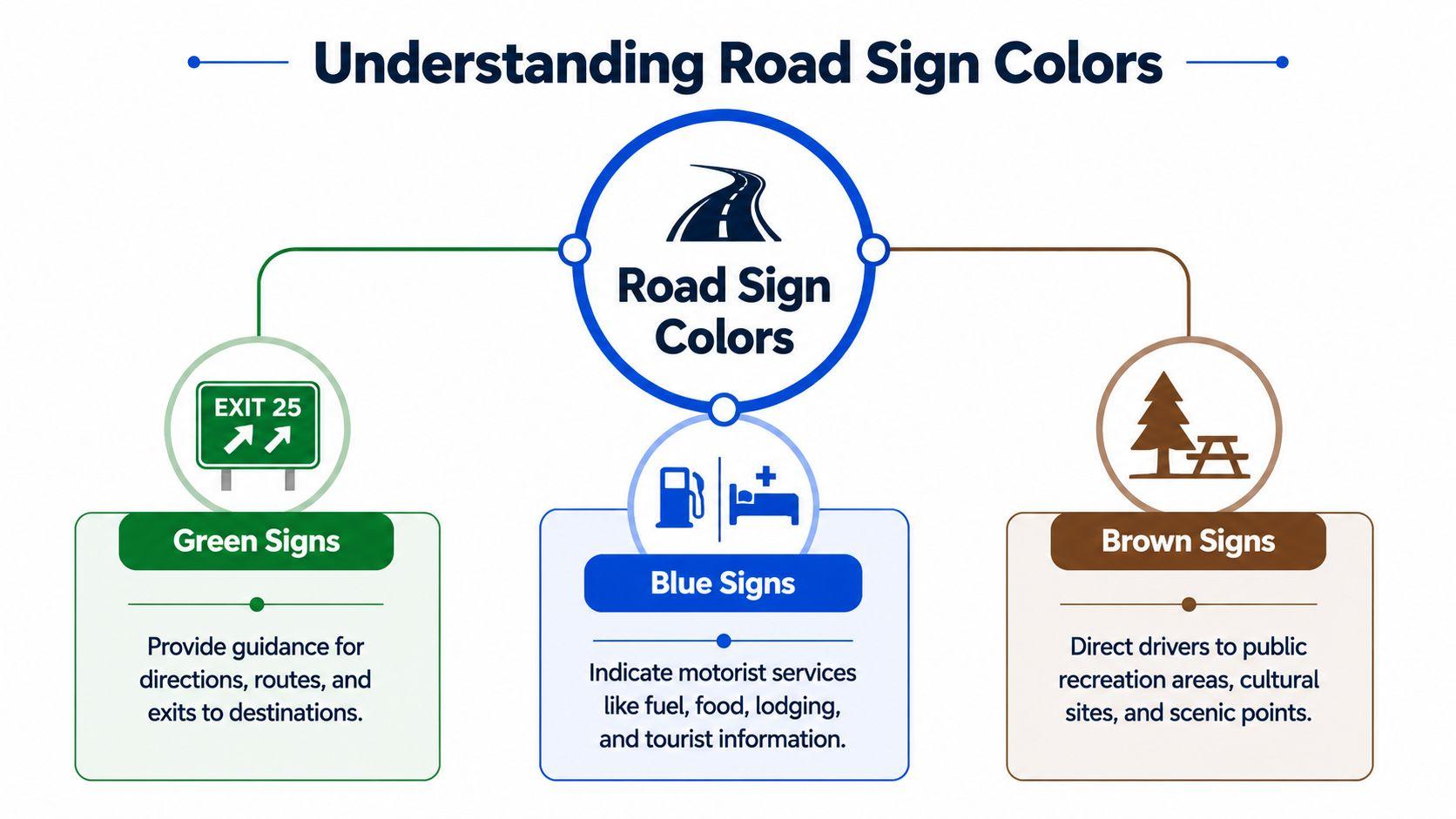
Green means directions and route guidance
When you see green, think movement and destination.
Green information signs commonly help with:
- Directions to places
- Street names
- Highway exits
- Route guidance
- Distance or destination information
A green sign is usually helping you continue your trip correctly. It's less about danger and more about navigation. On a test question, green often points you toward the answer choice related to routes, destinations, or directional guidance.
A simple example is an exit sign for a named road. Another is a sign showing which lane or route leads to a town or highway.
Blue means services for drivers
When you see blue, think support.
Blue information signs often point to:
- Hospitals
- Fuel
- Food
- Lodging
- Tourist information
- Parking or traveller services
These signs tell you what's available for motorists. If you're on a longer drive, blue signs help you solve practical needs without taking your eyes off the road for too long.
Many learners confuse blue service signs with regulatory parking signs because both can mention parking. The difference is purpose. A blue information sign may show that parking is available. A regulatory sign tells you whether you may or may not park there under specific rules.
Blue signs usually answer, “What service can I find here?”
Brown means recreation and cultural points of interest
When you see brown, think leisure, public attractions, and places people visit rather than pass through.
Brown signs commonly guide you to:
- Parks
- Conservation or recreation areas
- Scenic points
- Historic or cultural sites
- Public attractions
These signs help drivers locate destinations that are not part of routine traffic control but still matter for travel.
Why symbols matter so much
Canada's sign systems gradually moved from more word-based signs to more symbol-based signage. That shift made information signs easier to understand quickly and easier to read for a multilingual population, especially in a province like Ontario where many different drivers use the same roads. You can see that broader historical point in this overview of Canada's move toward symbol-based signage.
That's why many information signs use familiar icons. A bed suggests lodging. A knife and fork suggest food. A white “H” on blue points to a hospital. You don't have to read a long sentence. You recognise the symbol and keep driving safely.
A quick memory tool
Here's a simple way to remember the three main colours:
Colour Think of Typical purpose Green Go to a place Routes, directions, destinations Blue Help for drivers Services and facilities Brown Visit a place Recreation and cultural sites
If you use that framework, many multiple-choice questions become much less intimidating.
Design and Placement How Signs Get Your Attention
A sign can have the right message and still fail if drivers can't read it in time. That's why sign design isn't just about colour or wording. It also depends on size, contrast, height, angle, and placement.
Why signs use large text and strong contrast
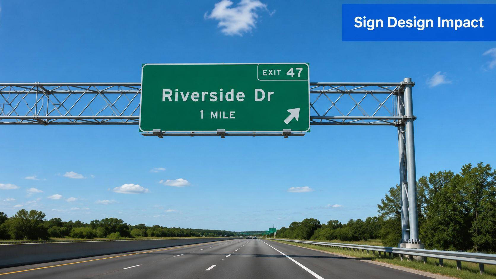
One practical sign-design rule says you should use 1 inch of letter height per 10 feet of viewing distance. So if a sign must be read from 50 feet away, the letters should be at least 5 inches high. The same guidance also recommends high-contrast colour pairs and mounting information signs around 60 inches centre height to improve visibility and scanning efficiency, as explained in this technical guide to information sign legibility.
That helps explain why road signs often look bold and simple. Drivers don't have time to study them. The sign has to be readable at a glance.
What your eyes are doing in real traffic
When you drive, your eyes scan ahead, then check mirrors, then return to the road. During that short scan, a sign has to stand out from everything around it. Trees, lights, storefronts, parked cars, and other signs all compete for your attention.
A well-designed information sign helps by using:
- Clear symbols instead of long text
- Strong contrast so letters and symbols stand out
- Predictable placement so drivers know where to look
- Consistent shapes and layouts that become familiar with practice
That consistency is why studying sign families works better than memorising isolated pictures.
Placement matters as much as message
A sign can seem obvious when you're standing still, then become hard to catch from a moving car. Angle and line of sight make a huge difference. A sign placed where drivers approach it head-on will usually be easier to notice than one that sits awkwardly off to the side.
A sign that's perfectly clear up close can still be ineffective if the driver sees it too late, at the wrong angle, or in poor light.
This short video gives a useful visual sense of how road signs have to work in motion:
For your G1, you probably won't be asked about sign engineering in technical language. But understanding this makes the test easier. It explains why signs are simple, repeated, and placed well before a turn, exit, or service point. The road system is trying to help you decide early, not at the last second.
Common Ontario Information Signs You Must Know
Learners usually want a clean list. That makes sense. You need practical examples you can recognise quickly. The key is to group them by purpose so you're not trying to memorise everything as one giant pile.
Direction and route signs
These are the signs that help you stay on course.
Common examples include:
- Street name signs
- Highway exit signs
- Destination signs
- Route markers
- Lane guidance signs
A green sign showing an upcoming exit for a named road is an information sign because it helps you prepare your route. It doesn't order you to leave the highway. It tells you where that exit will take you.
A route marker does something similar. It identifies the road you're on or the route you need to follow.
Service signs
These are among the easiest to recognise once you know the blue background pattern.
Typical examples:
- Hospital
- Parking
- Fuel
- Food
- Lodging
- Tourist information
The hospital sign is a classic G1 example. It usually appears with a medical symbol or a clear “H” style marker on a blue background. The test may ask what the sign means directly, or it may ask you to identify the category.
If you want more direct sign-by-sign review, this Ontario road signs test guide is useful for focused study.
Recreation and public-interest signs
Brown signs tend to feel less urgent, so learners sometimes overlook them. Don't. They still appear in study materials and support real-world navigation.
You may see signs for:
- Parks
- Scenic lookouts
- Conservation areas
- Historic sites
- Campgrounds or picnic areas
These tell you that a recreational or cultural destination is nearby. They don't control your driving, but they do communicate useful travel information.
Why some signs are easier to notice than others
Official guidance on sign placement stresses that signs should be placed at about a right angle to approaching traffic, and supports may need retroreflective material for better nighttime visibility. That improves the driver's line of sight and helps quick recognition in real conditions, as outlined in this FHWA guidance on sign placement and visibility.
That helps explain a common learner complaint: “I know the sign when I study it, but I miss it on the road.” Often the issue isn't knowledge alone. It's the speed, angle, and lighting of real driving.
A practical way to study these examples
Try this three-part question every time you review a sign:
- What colour is it?
- What job is it doing?
- Where would I likely see it?
For example:
Sign type Likely colour What it tells you Hospital Blue A medical service is nearby Highway exit Green A route or destination is ahead Park or attraction Brown A recreation or cultural site is nearby
If you answer those three questions consistently, you'll build a much stronger memory than if you only flip through flashcards.
Information Signs vs Other Sign Categories
A lot of G1 mistakes happen because the learner knows what the sign says, but not what category it belongs to. That matters because categories tell you how to respond.
Information signs guide you
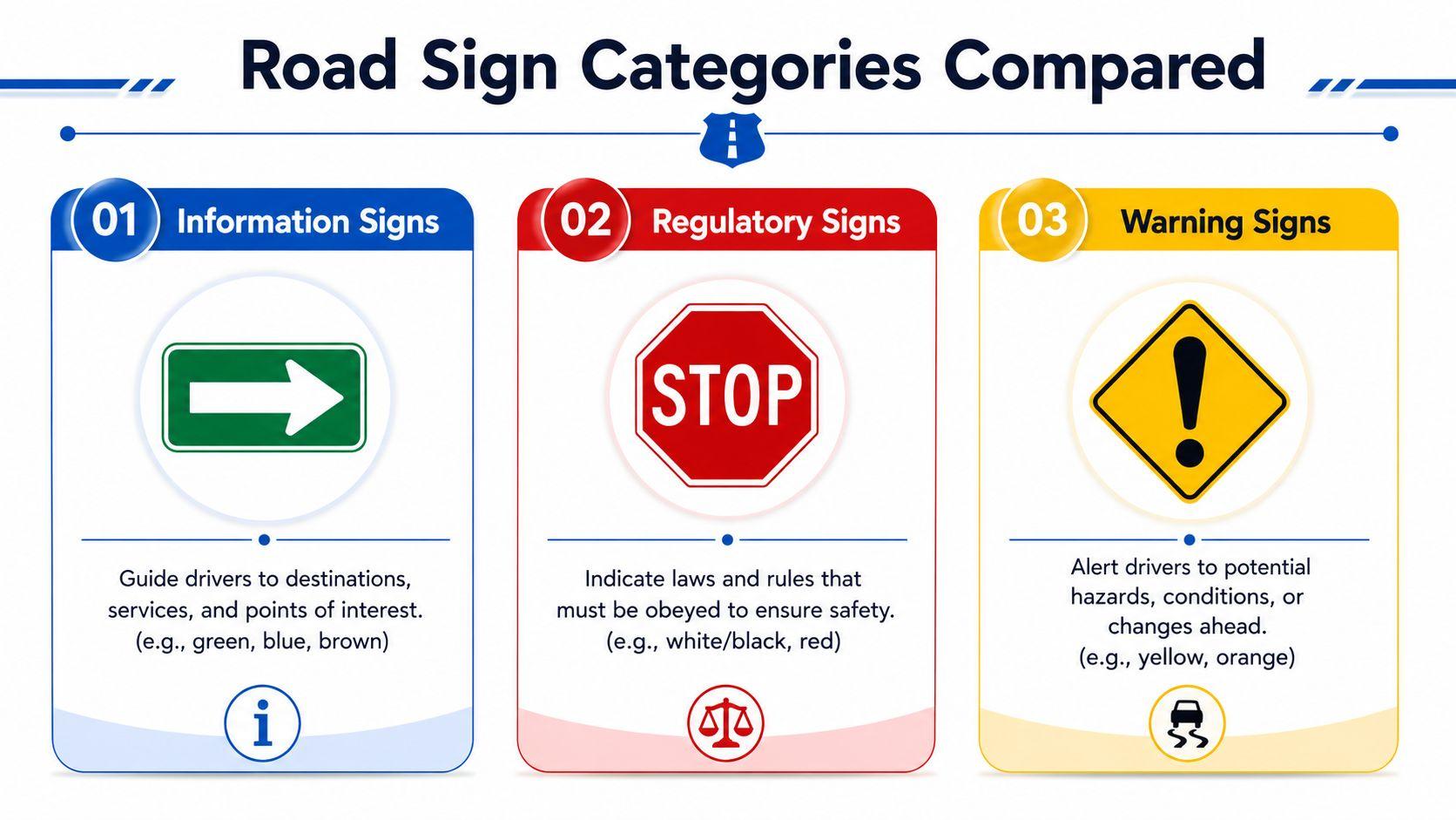
Information signs are there to help you find your way. They point to destinations, services, and public-interest locations. Their usual colours include green, blue, and brown.
Your response is usually to notice, understand, and plan.
Examples:
- Green exit sign
- Blue hospital sign
- Brown park sign
Regulatory signs tell you the law
Regulatory signs set rules you must obey. They often use white, black, and red. These signs are not suggestions.
Your response is to comply.
Examples:
- Stop
- No parking
- Speed limit
- Do not enter
If you ignore a regulatory sign, you can break the law or create immediate danger.
Warning signs alert you to hazards or changes ahead
Warning signs tell you to prepare for a condition or hazard. They often use yellow or orange and frequently appear in diamond shapes.
Your response is to slow down, scan, and adjust.
Examples:
- Curve ahead
- Lane reduction
- Slippery road
- Construction warning
Research discussed in a Local Road Research Board video notes that warning signs do not all affect drivers in the same way. Curve and chevron signs reliably change driver behaviour, while other warning signs may not consistently reduce speeds or crash rates. That distinction appears in this discussion of how different warning signs affect driver behaviour.
One easy comparison
If the sign helps you find something, it's probably information. If it tells you what you must do, it's regulatory. If it alerts you to trouble ahead, it's warning.
Here's the quick comparison:
Category Main purpose Common colours Driver response Information Guide Green, blue, brown Navigate Regulatory Control White, black, red Obey Warning Alert Yellow, orange Prepare
When you practise G1 questions, train yourself to identify the category before choosing the meaning. That extra step often prevents rushed mistakes.
How to Master Information Signs for Your G1 Test
Cramming sign pictures the night before usually doesn't work well. Information signs make more sense when you study them in groups and test yourself in short rounds.
Study by pattern, not by random order
Use these habits:
- Group by colour: Study green signs together, then blue, then brown.
- Say the purpose out loud: “This is guidance to a destination.” “This is a service sign.”
- Pair sign with location: Think highway, city street, service area, hospital zone, or park entrance.
- Mix recognition with recall: Don't just look and nod. Cover the answer and name it yourself.
Practise with questions that force a decision
A good practice question doesn't just ask, “What sign is this?” It may also ask:
- What category is it?
- What should a driver expect nearby?
- Is it giving guidance, a rule, or a warning?
That kind of practice is useful because it mirrors the confusion learners often feel on the actual test. If you want a focused sign drill, G1ready.ca road signs practice includes targeted road sign questions, immediate feedback, and explanations tied to Ontario study needs.
A calm test-day approach
When you see a sign question:
- Check the colour first.
- Identify the category.
- Ask what the sign is helping you do.
- Eliminate answers that sound like warnings or commands if the sign is informational.
That short routine keeps you from overthinking.
You do not need to become a traffic engineer to pass the G1. You just need a reliable mental system. Learn the colours, connect them to purpose, and practise until the categories feel familiar.
If you're preparing for the Ontario knowledge test, G1ready.ca offers registration-free practice exams, targeted road sign quizzes, and exam-style questions that let you review mistakes right away. It's a practical way to turn sign recognition into test-ready confidence.